
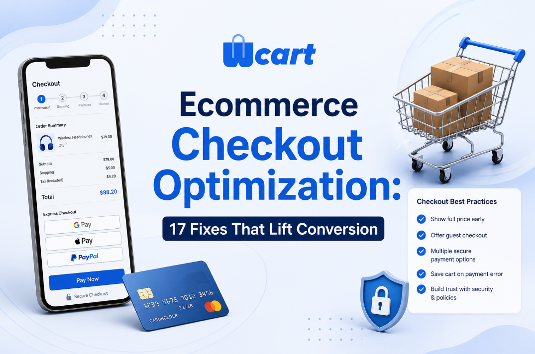
Ecommerce Checkout optimization means stripping friction out of the final purchase steps so that more of the people who add to cart actually pay. The fixes that move the needle are no secret: offer guest checkout, cut the number of form fields, show the full cost (shipping and tax included) early, surface trusted payment methods like wallets, and never let a payment error wipe the cart.
Most stores sit somewhere in the rough 65–75% checkout abandonment range according to aggregated industry research, so even modest reductions add up to real money. The 17 fixes below are ordered roughly by impact and effort, and they come from hands-on platform work rather than theory.
By the Wcart team, we build and support white-label ecommerce and multi-vendor marketplace software, so this is written from hands-on platform experience.
If you change one thing on your store this quarter, make it the checkout. It is the narrowest part of the funnel, the moment a shopper has already decided to buy, and the spot where avoidable friction throws away revenue you have already paid to acquire.
This guide is the hub of our checkout cluster. It covers the full landscape of Ecommerce checkout optimization and links out to deeper guides on the decisions that deserve their own page.
Why checkout is where revenue leaks fastest
Acquisition is expensive. Ads, SEO, email, influencer spend, all of it exists to get a shopper to the cart. By the time someone reaches checkout, you have already spent your hardest-won budget. A leak here costs you the most because every lost order is a fully-paid-for visitor walking away at the register.
Research consistently puts average documented cart abandonment in the high-60s to mid-70s percent range. The widely-cited Baymard Institute cart abandonment research aggregates dozens of studies and breaks down the reasons. The recurring culprits are not mysterious: surprise costs, forced account creation, a long or confusing process, distrust of the payment step, and too few payment options. Almost all of them are fixable with configuration, not a rebuild.
The 17 fixes, grouped by where they act
Group A – Reduce friction in the form
1. Offer guest checkout. Forced account creation is one of the most reliable abandonment drivers there is. Let people buy first and offer the account afterward. A one-click “set a password to save this order” on the confirmation page captures most of the benefit. We dig into the trade-off in our guest checkout vs forced account creation guide.
2. Cut form fields to the minimum. Every field is a decision and a chance to bounce. Combine first and last name where the locale allows, drop “company” unless you sell B2B, and never ask for data you will not use.
3. Auto-fill and autocomplete address. Use address autocomplete and respect the browser’s autocomplete attributes so saved profiles populate instantly. On a modern platform this is mostly free, and it removes the single most error-prone block of fields.
4. Default to a single address when billing equals shipping. Show one address with a “billing is different” toggle instead of two full forms by default.
5. Validate inline, not on submit. Flag a bad postcode or a malformed email the moment someone leaves the field, not after they press Pay and watch the whole page reload.
6. Use the right keyboard and input types on mobile. Numeric keypad for card and zip, email keyboard for email. A tiny detail with an outsized effect on mobile conversion.
Group B – Build trust and price clarity
7. Show the full price early. Unexpected shipping, tax, or fees at the last step is the top documented reason people abandon. Surface shipping estimates in the cart and never reveal a new cost on the payment screen.
8. Show a persistent order summary. Keep line items, quantities, and the running total visible throughout checkout so nobody has to trust a black box.
9. Display trust signals near the payment field. A small lock icon, the words “secure payment,” and recognizable card and wallet logos at the point of payment ease the fear of typing in card details.
10. Make the return and shipping policy reachable without leaving checkout. A link that opens in a modal or accordion answers the “what if it goes wrong” objection without sending the shopper away.
11. Localize currency, language, and tax presentation. Showing prices in the shopper’s currency with the correct inclusive or exclusive tax framing heads off both surprise and distrust in international markets.
Group C – Payment and resilience
12. Offer the payment methods your market actually uses. Cards alone are not enough. Digital wallets, regional methods (UPI, iDEAL, and the like), and buy-now-pay-later where relevant each unlock a segment that would otherwise bounce.
13. Expose express wallets at the top. Apple Pay, Google Pay, and similar one-tap wallets can collapse the entire form for returning shoppers. Put them above the manual form, not buried below it. Browser support details live in the MDN Payment Request API documentation.
14. Never let a payment failure clear the cart. A declined card should drop the shopper back at the payment step with the cart intact and a plain-English reason. This one earns its own guide. See reducing abandonment at the payment step.
15. Retry and route intelligently. Soft declines can often be retried, and offering an alternate method right after a decline recovers orders that would otherwise be gone for good.
16. Keep the checkout fast. Slow pages bleed conversions. Audit checkout performance with field-data tooling such as Google’s Core Web Vitals guidance, and treat the payment step as a performance-critical path. In practice the payment step is often the slowest part of the whole flow, because that is where third-party scripts, fraud checks, and redirects pile up. It is worth budgeting load time there separately from the rest of the site.
17. Send a triggered recovery email. For shoppers who entered an email but did not finish, a timely, polite recovery message brings back a meaningful share of otherwise-dead carts.
One-page vs multi-step: a quick comparison
The most-debated checkout decision is layout. There is no universal winner. It depends on your catalog, your traffic mix, and how much data you genuinely need. Here is how the two patterns tend to trade off. For the full treatment, see one-page vs multi-step checkout.
| Factor | One-page checkout | Multi-step checkout |
|---|---|---|
| Perceived effort | Lower, everything visible at once | Can feel longer, but each step is lighter |
| Mobile experience | Can become a long scroll | Often cleaner; one decision per screen |
| Analytics granularity | Harder to see where people drop | Step-by-step funnel is easy to measure |
| Best fit | Simple catalogs, returning shoppers, few fields | Complex orders, new shoppers, shipping choices |
| Risk | Overwhelm if fields aren’t trimmed | Extra clicks if steps aren’t justified |
Our honest position: trim the fields first, then test the layout. A bloated one-page checkout and a bloated multi-step checkout both lose. Layout matters far less than field count and cost clarity.
How to actually run Ecommercecheckout optimization (the method)
1.Instrument before you change anything
You cannot optimize what you cannot see. Add funnel events for cart view, checkout start, address complete, payment start, and purchase. The gap between any two consecutive steps tells you exactly which fix to prioritize. Skip this and you are guessing.
2.Fix the obvious leaks, then test the debatable ones
Some fixes are not worth A/B testing. Guest checkout, inline validation, showing total cost early, and keeping the cart after a failed payment are simply correct. Save experimentation for the genuinely contested choices: layout, the order of payment methods, whether to add BNPL, copy on the pay button.
3.Test honestly
Run one change at a time, give the test enough volume to reach significance, and resist calling a winner early. Checkout traffic is high-intent and lower-volume than top-of-funnel, so tests settle slower than you expect.
Here is what actually happens when you call a checkout test after two days: the early “winner” is usually noise from a handful of high-value orders, and it reverses once the sample fills out. If you lack the volume for clean A/B tests, lean on the established best practices above and validate with qualitative session replay instead.
Platform-level levers most teams forget
Beyond the storefront, the platform itself sets the ceiling on how far you can optimize. A few levers that are easy to overlook:
- Tokenized, saved payment methods so returning customers check out in one tap without you ever touching raw card data.
- Per-market payment routing so a shopper in one country automatically sees locally trusted methods.
- Server-side cart persistence so a dropped connection or a payment retry never loses the order.
- Marketplace nuance: in multi-vendor setups, split payments and per-vendor shipping must not turn into multiple confusing checkouts. Aggregate the experience even when fulfillment is split.
If your current stack fights you on any of these, that is a platform constraint rather than a design one, and it is worth weighing in a migration decision. Wcart is built so these levers are configuration, not custom engineering. You can see the capabilities on the Wcart platform.

























Leave a Reply