Have you ever scrolled to the bottom of an online store and found exactly what you needed a contact number, a returns policy, an app download link right there, neatly laid out?
Now think about the stores where the footer is a mess. Wrong links. Missing policies. No social icons. No trust signals at all. Most shoppers don’t consciously notice a well-designed footer. But they absolutely notice a bad one. And when they can’t find what they’re looking for, a lot of them just leave.
The footer is the last thing a visitor sees on every page of your store. It’s where shoppers go when they want to find your return policy, reach your support team, follow you on social media, download your app, or sign up to your newsletter. A poorly built footer doesn’t just look unprofessional it costs you trust, and trust costs you sales.
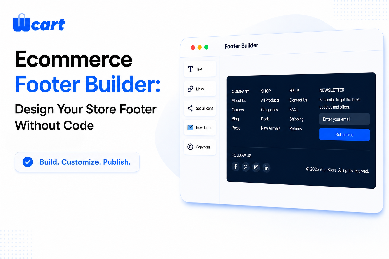
Wcart has launched its new Ecommerce Footer Builder, a drag-and-drop visual tool that gives store owners full control over how their footer looks, what it contains, and how it’s organised, all without needing a developer or a single line of code.
What Is an Ecommerce Footer Builder?
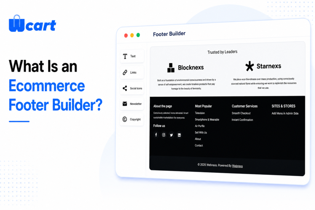
An ecommerce footer builder is a visual design tool that lets store owners create and customise the bottom section of their online store without writing code. Instead of being stuck with whatever footer layout came with your theme, you get full control over what appears, where it appears, and how it looks.
The Wcart Footer Builder works through a drag-and-drop interface inside the admin panel. You pick the blocks you want logos, menus, social icons, newsletter forms, payment badges, app store buttons, and more place them into columns, style them, and publish. It takes minutes, not days. Think of it as a page builder, but specifically designed for your store’s footer, with all the ecommerce-specific elements already built in and ready to go.
Launch Your Ecommerce Website in Minutes With Our Easy Builder.
Why Your Store Footer Matters More Than You Think
Most of the attention in ecommerce design goes to the homepage, product pages, and checkout flow. The footer is often treated as an afterthought a place to dump links and move on. That’s a mistake.
Your footer appears on every single page of your store. A first-time visitor who lands on a product page and wants to check your return policy before buying will scroll straight to the footer. A returning customer who wants to download your app will look there too. A potential wholesale buyer looking for a contact number — same thing.
What a well-designed footer does for your store:
- Builds trust by surfacing policies, contact details, and payment icons clearly
- Reduces bounce rate by helping shoppers find what they need instead of leaving
- Encourages newsletter signups and social media follows
- Promotes your iOS and Android apps to mobile visitors
- Improves SEO through consistent internal linking across every page
- Signals professionalism to first-time visitors who are still deciding whether to trust you
A cluttered, disorganised, or incomplete footer does the opposite of all of that. The good news is that with the right tools, fixing it takes less time than you’d think.
Why Traditional Footer Systems Fall Short
Common footer frustrations merchants face:
- Can’t add a newsletter signup block without a third-party plugin.
- No built-in option to show payment method icons in the footer.
- App store badges require custom code to display properly.
- Changing the column layout breaks on mobile.
- Footer updates require a developer ticket and a waiting period.
- Can’t save multiple footer versions and switch between them.
Introducing the Wcart Footer Builder
Wcart has built a dedicated Footer Builder that gives store owners complete visual control over their store’s footer. It’s part of the same Appearance suite as the Advanced Header Builder but the Footer Builder is designed around the unique content and trust-building role that the footer plays in an ecommerce store.
One important distinction from the Header Builder: the Footer Builder works entirely through the Preset system. Rather than offering a separate Custom and Preset mode, the Footer Builder gives you 10 professionally designed preset layouts as your starting point, then lets you fully customise every element rows, columns, blocks, content, and styling all from the same visual editor.
This approach means you get a solid, well-structured starting layout immediately, without building from scratch, and then you can customise as much or as little as you want from there.
How to Access the Footer Builder
Step 1: Getting into the Footer Builder is simple. From your Wcart admin panel, follow this path:
Settings → Appearance → Layout Settings → Footer
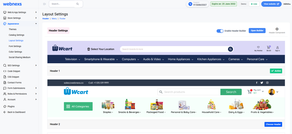
Step 2: Once inside Layout Settings, click the Footer tab at the top of the page. You will see the Footer Settings panel with a live preview of your current footer design displayed below.
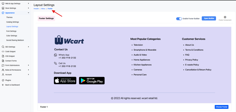
Step 3: From the Footer Settings panel, two key controls appear in the top-right corner:
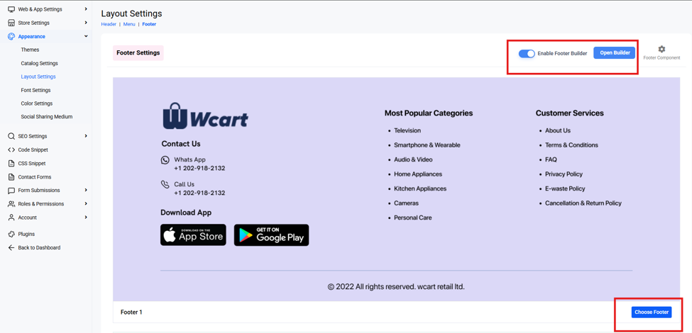
- Open Builder button – click this to launch the full visual editor
- Choose the Footer – Select the Footer template For Your live storefront
- Enable Footer Builder toggle – switch this on to activate the builder for your live storefront
Your Store Header Deserves More Than a Basic Menu
Discover how Wcart’s new Header Builder helps you create engaging navigation experiences without coding.
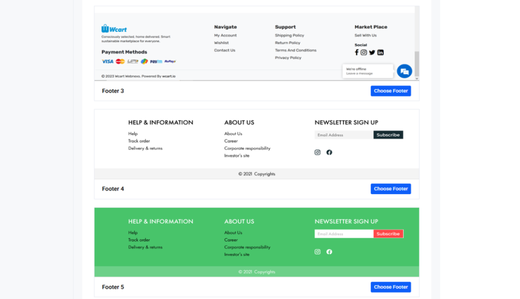
Start Fast with 10 Pre-Built Footer Templates
When you open the Footer Builder for the first time, you don’t start with a blank screen. Wcart provides 10 professionally designed footer templates that are ready to use immediately. These aren’t generic starter layouts, each template is designed around real ecommerce use cases, with different column structures, content priorities, and visual styles.
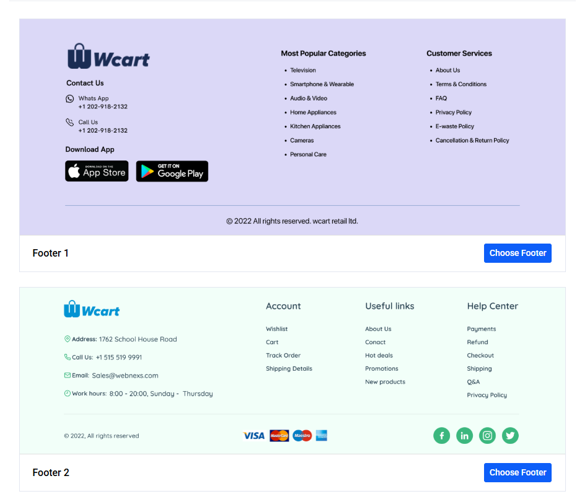
To browse them, click Presets in the top-right corner of the Footer Builder. A panel opens showing all 10 available footer designs as visual previews. Click any one to load it into the editor instantly.
Why starting from a template matters:
- You get a working, well-structured footer in seconds
- Column widths and spacing are already balanced and tested
- Content hierarchy is thought through menus, contact, social, copyright in the right order
- Reduces design decisions for merchants who aren’t designers
- You can customise from a strong starting point rather than building everything from scratch
Once a template is loaded, every part of it is fully editable. Change colours, rearrange columns, swap content blocks in and out, update text the template is your starting point, not a constraint.
Inside the Footer Builder: Rows, Columns, and Slots
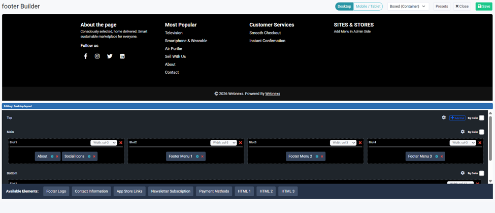
The Footer Builder uses a simple three-layer structure: Rows → Columns → Blocks. When you open the builder, you’ll see the editing panel below the live footer preview. The panel is divided into sections called Top, Main, and Bottom — these represent horizontal rows of your footer
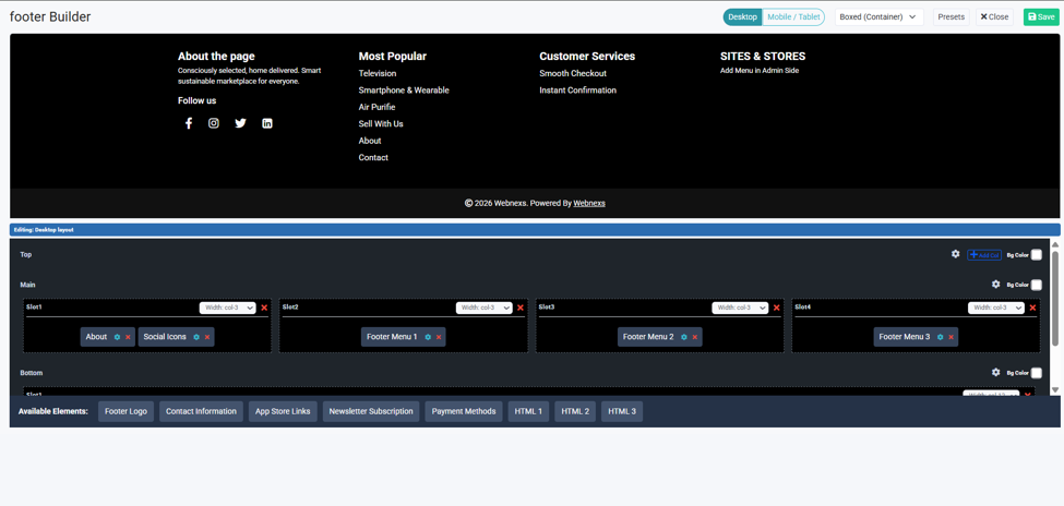
Rows
Rows are the horizontal bands of your footer. A typical ecommerce footer has three rows:
- [object Object] — often used for a newsletter signup or a promotional banner
- [object Object] — the core content area with logos, menus, social icons, and contact details
- [object Object] — copyright line, payment icons, and secondary policy links
Each row can have its own background colour, set independently using the Bg Color control on the right side of the row header. This is how stores create a two-tone footer a dark main section with a lighter copyright strip below.
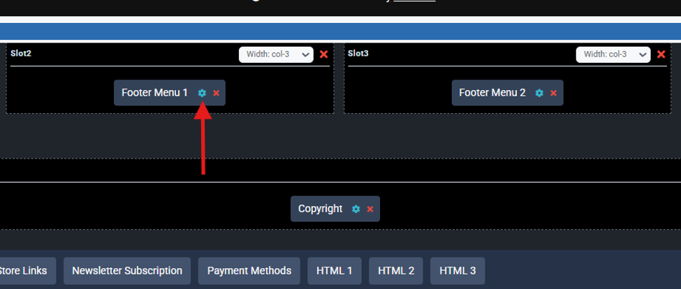
Columns (Slots)
Columns are the vertical divisions within each row. In the Main row, you might have four equal columns Slot 1, Slot 2, Slot 3, Slot 4, each set to Width: col-3 for equal spacing. You can adjust each column’s width using the dropdown, and add or remove columns using the + Add Col button. This lets you create anything from a simple two-column layout to a detailed four-column information grid.
Blocks
Blocks are the actual content elements that live inside each slot the logo, menus, social icons, newsletter form, and so on. You drag them in from the Available Elements bar at the bottom of the editor. The three-layer system gives you precise layout control without any code.
Editing Elements: Full Control Over Every Block
Adding a block to a slot is just the starting point. Every block in the Footer Builder is fully editable. Click the settings icon on any block and an Edit Element modal opens, giving you control over that block’s content and configuration.
For a Footer Menu block, you can set the Element Name (internal reference), the Menu Title (the heading displayed above the links in the footer), and which of your existing menus to display.
For a Social Icons block, you can choose which platforms to show and enter each profile URL. For an About block, you write and format your store description directly in the editor. For App Store Links, you configure your App Store and Play Store URLs.
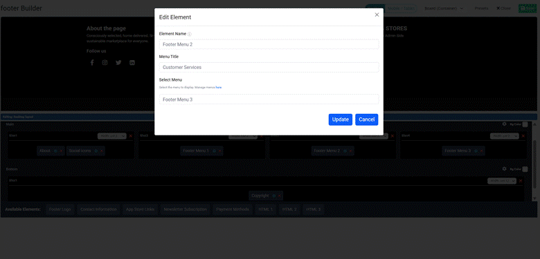
Every configuration made in the Edit Element modal reflects immediately in the live footer preview above the editor, so you always see exactly what your footer will look like before you publish.
All the Footer Blocks You Can Add
The Available Elements bar shows all the content blocks you can add to any slot. These are purpose-built for ecommerce footers not generic website widgets. Here’s what’s available:
- Footer Logo – Display your store’s logo in the footer.
- Contact Information – Add your WhatsApp number, call line, email address, or physical address.
- About (Text Block) – A short description of your store what you sell, your brand values, your mission.
- Footer Menu (Menu Columns) – Link any of your existing navigation menus into the footer as a column of links. Common uses include Quick Links, Information, Customer Services, My Account, and Most Popular Categories.
- Newsletter Subscription – Capture email signups directly from the footer.
- Social Icons – link to your social media profiles Facebook, Instagram, X, LinkedIn, YouTube, and more.
- App Store Links – Display Apple App Store and Google Play Store badges to promote your mobile shopping app.
- Payment Methods – Show accepted payment method icons credit cards, UPI, PayPal, buy-now-pay-later, and more.
- Copyright Line – An automatic copyright notice that stays current without you needing to update it every year. One less thing to forget.
- Custom HTML – For anything not covered by the standard blocks. Embed tracking pixels, add custom widgets, include structured data markup, or any other HTML you need
Desktop and Mobile Views in One Builder
Shoppers browse online stores on different devices throughout the day. They might discover your store on a phone, continue browsing on a tablet, and complete a purchase on a laptop. Your footer needs to look right on all of them and the Wcart Footer Builder gives you dedicated controls for each screen type without leaving the editor.
Desktop Footer
Use the Desktop and Mobile / Tablet toggle buttons at the top of the Footer Builder to switch your editing view. What you see in each view is exactly how your footer will render on that device.
On desktop, your footer has the most screen real estate to work with. This is where you can make full use of multi-column layouts four columns side by side, wide menu lists, large logos, and detailed contact information all sitting neatly in the same row without crowding each other.
Mobile / Tablet Footer
More than half of all ecommerce traffic now comes from smartphones and tablets. On these smaller screens, a four-column desktop footer becomes unreadable if not adapted columns either get squeezed into tiny strips or overflow the screen entirely.
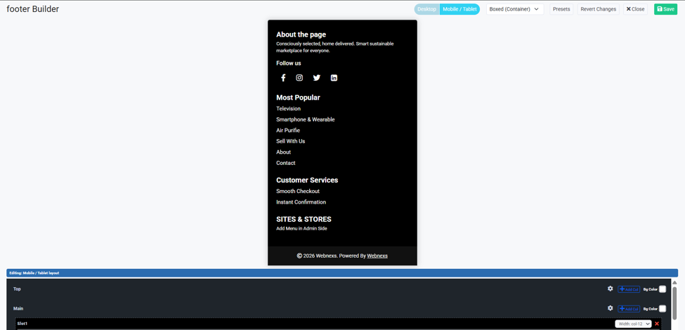
The Footer Builder’s Mobile / Tablet view shows you exactly how your footer stacks on smaller screens. Columns in the Main row automatically stack vertically, so your four desktop columns become four stacked sections on mobile.
You can review this stacking order and adjust it so the most important content contact details, key links, newsletter signup appears near the top of the footer stack rather than buried at the bottom.
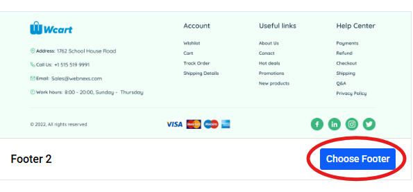
Save Multiple Footers – Switch in One Click
One of the most practical features of the Wcart Footer Builder is the ability to save multiple footer designs and switch between them instantly.
At the bottom of the Footer Settings page, saved footer designs are labelled as Footer 1, Footer 2, and so on. When you want to make a design live, click Choose Footer next to the version you want.
This is useful in several real ecommerce scenarios:
- [object Object] — build a sale-season footer with a promo link and switch it live during the campaign, then switch back to your standard footer when the promotion ends
- [object Object] — create a launch footer with a specific CTA and activate it for launch week without editing your permanent footer
- [object Object] — run different footer structures for different periods to see which drives more newsletter signups or app downloads
- [object Object] — build multiple footer options for a client, present them for approval, and activate the chosen one without rebuilding anything.
Wcart Footer Builder vs Shopify, WooCommerce, and Wix
| Feature | Wcart | Shopify | WooCommerce | Wix |
| Visual Footer Editor | Yes – built-in | Theme dependent | Page builder needed | Yes |
| Pre-built Templates | 10 templates | Theme dependent | Plugin dependent | Limited |
| Drag-and-drop blocks | Yes | No native builder | Plugin required | Yes |
| App Store badges block | Built-in | Custom code | Plugin required | Manual |
| Payment icons block | Built-in | Theme dependent | Plugin required | Manual |
| Newsletter block in footer | Built-in | App required | Plugin required | Built-in |
| Per-row background colour | Yes | Limited | Plugin dependent | Basic |
| Multiple saved footers | Yes | No | No | No |
| One-click footer switch | Yes | No | No | No |
| No coding required | Yes | Sometimes | Often | Mostly |
| Responsive preview controls | Desktop + Mobile/Tablet | Limited | Plugin dependent | Basic |
Who Is the Footer Builder For?
✔ Store owners building their first store – You don’t need to know anything about CSS or HTML. Pick a template, customise the content, publish. A professional ecommerce footer in minutes not days.
✔ Merchants who update their store frequently – If you regularly change your promotions, update policy links, launch on new social channels, or add new payment methods, the Footer Builder lets you make those changes yourself no developer ticket, no waiting.
✔ Agencies and designers building client stores – Build multiple footer options, present them to the client, and let them choose. Then hand over a store where the client can make future footer updates on their own without breaking anything.
✔ Growing businesses expanding their channels – Adding a mobile app? Drop in the App Store and Google Play badges. Launching on a new social platform? Add the icon in thirty seconds. The Footer Builder grows with your store.
✔ Multi-region or multi-brand stores – Build different footer designs for different store variants, different contact details, different policy links, different languages and switch between them instantly as needed.
Conclusion
The footer is one of the most visited sections of any ecommerce store, and one of the most overlooked in the design process. It’s where shoppers go when they need reassurance policies, contact details, payment options, social proof. A well-built footer doesn’t just look good. It builds trust, reduces bounce rate, and keeps shoppers engaged long enough to complete a purchase.
The new Wcart Footer Builder gives every store owner the tools to build exactly that kind of footer without code, without a developer, and without compromise. With 10 ready-made templates, a flexible row-and-column layout system, purpose-built ecommerce blocks, dedicated desktop and mobile preview controls, and the ability to save and switch multiple footer designs instantly, it puts complete footer control in the hands of the merchant.
Whether you’re launching a new store, refreshing an existing one, or managing a portfolio of client stores, the Footer Builder is built for the way ecommerce actually works in 2026.
Ready to scale your enterprise ecommerce operations? Discover how Wcart helps businesses build powerful, flexible, and future-ready online stores.
Frequently Asked Questions (FAQs)
Related guide: Store Design & Themes on Wcart the complete hub.


Leave a Reply