Neither one-page nor multi-step checkout wins universally. The better-converting layout depends on your average order complexity, your traffic mix, and how well each one is actually built. One-page checkout reduces perceived effort and tends to help simple, low-SKU, mobile-heavy stores.
Multi-step checkout reduces cognitive load per screen and tends to help higher-consideration purchases, longer forms, and stores that need clean analytics on where buyers drop off. In practice, a well-engineered version of either usually beats a sloppy version of the other, so execution and field-level friction matter more than the format label. The only reliable way to know which converts better for your store is to A/B test both with your real traffic.
“One-page vs multi-step checkout” is one of the most argued questions in ecommerce conversion work, and most of the strong opinions online are really arguments about one specific implementation someone tested once. This guide gives you the honest trade-offs, the situations where each layout tends to win, and a practical framework for deciding, without pretending there’s a single right answer.
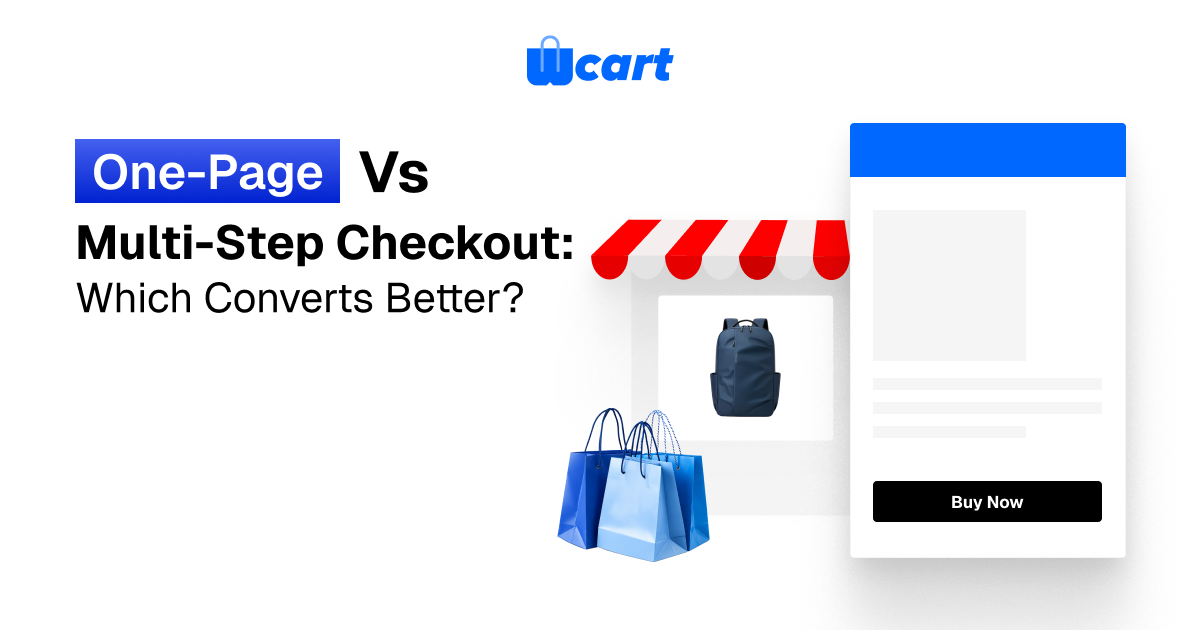
What each checkout pattern actually is
One-page (single-page) checkout
A one-page checkout collapses the entire purchase flow (contact details, shipping address, shipping method, and payment) onto a single screen. The customer scrolls, or moves through inline accordions, and submits once. The promise is fewer page loads, fewer clicks, and a sense that the finish line is visible the whole time.
Multi-step (multi-page) checkout
A multi-step checkout splits the same fields across discrete steps, typically: information, then shipping, then payment, then review. Each step shows only what’s relevant, often with a progress indicator. The promise is lower per-screen cognitive load and the ability to validate and save data progressively.
Worth noting: the line between them blurs. A “one-page” checkout with sequential accordions behaves a lot like a multi-step flow on one URL, and a multi-step flow with auto-advance can feel nearly as fast as one page. The label matters less than the experienced friction.
One-page vs Multi-step checkout : the core trade-offs
| Dimension | One-page checkout | Multi-step checkout |
|---|---|---|
| Perceived effort | Lower, the end is visible; feels like one task | Higher upfront, but each screen feels small |
| Cognitive load per screen | Higher, all fields at once can overwhelm | Lower, focused, one decision at a time |
| Page loads | Fewer (often one submit) | More transitions (mitigated by AJAX/SPA) |
| Mobile experience | Long scroll; can feel endless on small forms done badly | Naturally chunked; easier thumb-reach per step |
| Drop-off analytics | Harder, fewer measurable stages | Easier, clear funnel step-by-step |
| Data capture for recovery | Often only on submit unless engineered | Email captured early enables abandonment recovery |
| Best-fit complexity | Simple orders, few fields, digital/repeat buys | Complex orders, address validation, tax/shipping logic |
| Error handling | Errors can scatter; harder to spot on long form | Errors isolated to the relevant step |
When one-page checkout tends to win
One-page checkout earns its reputation in a specific set of conditions. If your store matches most of these, it’s a reasonable default to test first:
- Few fields. If you only need email, one address, and payment, spreading that across four screens adds ceremony without benefit.
- Low-consideration purchases. Impulse buys, refills, and repeat orders reward speed. Every extra transition is a chance to reconsider.
- Returning customers with saved data. When most fields are pre-filled, a single confirm-and-pay screen is close to ideal.
- Digital goods. No shipping step means the form is already short, so consolidating it is natural.
- Strong autofill and express pay. When wallets (Apple Pay, Google Pay, and the like) and browser autofill carry most of the load, the single screen barely needs typing.
The risk with one-page checkout is that a long single form looks intimidating before the customer reads a word of it. The fix is visual chunking: group fields into clear sections, lazy-reveal payment after shipping is valid, and keep the call-to-action sticky so the customer always knows the next move.
One thing we’ve watched happen on live stores is that a single tall form pushes the pay button so far below the fold that customers on mid-range phones genuinely don’t believe they’ve reached the end, so they re-scroll, second-guess, and bail. A sticky CTA quietly kills that loop.
When multi-step checkout tends to win
Multi-step checkout shines when the purchase genuinely has more to decide and you need to manage attention:
- Complex or regulated orders. Multiple shipping destinations, gift options, tax-exemption fields, or age/identity checks are calmer one step at a time.
- Higher average order value. Buyers spending more expect a deliberate, reassuring flow; rushing them can feel less trustworthy.
- Marketplaces with multiple vendors. When an order spans several sellers with different shipping rules, a structured flow keeps the math legible, something we see constantly in multi-vendor builds.
- You need clean funnel analytics. Discrete steps give you a measurable drop-off point. “We lose 40% at the shipping step” is an actionable insight; “we lose people on the page” is not.
- Early email capture matters. Collecting the email on step one, before the customer abandons, is what powers abandoned-cart recovery. This is one of the most underrated advantages of the multi-step pattern.
The risk with multi-step is the transition tax: every page change is latency plus a moment to bail. Modern implementations cut this dramatically by loading steps asynchronously, auto-advancing on valid input, and persisting entered data so a back button never wipes work.
Here’s what actually happens when you skip that persistence step: a customer fat-fingers their postcode on the shipping screen, taps back to fix the address, and the whole form resets to blank. They don’t email you about it. They just close the tab, and you’ll never see why in your analytics.
The honest truth about “which converts better”
You’ll find blog posts claiming one-page checkout lifts conversion by a specific double-digit percentage, and others claiming the opposite. Treat both with suspicion. Those numbers come from a single store’s single test against a single baseline, and they don’t transfer to your traffic, your products, or your existing friction. We won’t invent a figure here.
What the broader body of UX research does consistently show is more useful: checkout abandonment is driven far more by specific friction than by page count. The Baymard Institute’s long-running checkout usability research repeatedly finds the top abandonment causes are extra costs revealed late, forced account creation, a long or confusing process, and payment-trust concerns, not whether the form lived on one URL or four.
You can read their public findings on Baymard Institute, and Google’s guidance for fast, well-structured commerce experiences on web.dev reinforces that performance and form usability move the needle more than layout philosophy.
Put plainly: a multi-step checkout that captures email early, validates inline, and never surprises you with shipping cost will beat a one-page checkout that hides fees until the end, and the reverse is just as true. Format is a lever. It is not the whole machine.
A decision framework you can actually use
Step 1: Count your required fields
If a logged-out first-time buyer needs roughly eight fields or fewer, lean one-page. If shipping, billing, tax, and options push you well beyond that, multi-step keeps each screen humane.
Step 2: Look at your device mix
Heavy mobile traffic favors chunking, either a true multi-step flow or a one-page layout with sequential accordions so the customer never faces a wall of inputs.
Step 3: Decide how badly you need funnel data
If you can’t yet see where customers drop, a multi-step flow gives you that visibility immediately. You can always consolidate later once you know which step bleeds.
Step 4: Protect your recovery pipeline
Whichever layout you choose, capture the email as early as technically possible. If you go one-page, fire the email to your backend on blur/validation, not only on final submit, so cart-recovery still works.
Step 5: Test, don’t assume
Run a real A/B test with adequate sample size and a single primary metric (completed orders, not micro-clicks). Run it long enough to clear weekday/weekend and payday cycles. Let your traffic decide.
Implementation notes from building checkouts
A few things consistently matter more than the one-page-versus-multi-step decision itself:
- Show total cost early. Surprise shipping or fees at the final step is the single most reliable way to lose a sale, regardless of layout.
- Offer guest checkout. Forcing account creation is a well-documented conversion killer. See our deep dive on the guest checkout vs forced account creation trade-off.
- Inline validation. Validate fields as the customer leaves them, not after a full-page submit that scrolls them back up to a red error.
- Persist data across steps and reloads. Nothing kills trust like a back button that erases a typed address.
- Make the payment step feel safe. Recognizable wallet buttons, card-network logos, and a visible secure-connection cue reduce last-second hesitation. For more on that specific moment, see reducing checkout abandonment at the payment step.
- Speed is a conversion feature. Whatever the layout, a slow transition or laggy form input quietly taxes every customer.
If you want the full checklist that sits above this comparison, our ecommerce checkout optimization guide covers the 17 fixes we apply most often. And if you’d rather have a platform where checkout is already engineered for both patterns and configurable per store, that’s exactly what Wcart is built for.
So, one-page or multi-step?
Default to one-page when your orders are simple, your traffic is mobile-heavy, and most buyers are returning. Default to multi-step when orders are complex, order value is high, you run a multi-vendor marketplace, or you need clear funnel analytics and early email capture. Then test your assumption. The store that consistently wins isn’t the one that picked the “right” format. It’s the one that removed friction and let its own data settle the debate.


Leave a Reply