In today’s digital age, having a well-designed shopping website is crucial for the success of any business. A good shopping website design can enhance the user experience, boost conversions, and increase sales. However, many website owners make common mistakes that can negatively impact their website’s performance.
In this article, we will discuss the five common mistakes that website owners make in their shopping website design and how to avoid them. By the end of this article, you will have a clear understanding of how to create a user-friendly, responsive, and effective shopping website that will drive conversions and increase sales.
Read More: To Know about Ecommerce Shopping Cart
Importance of a Good Shopping Website Design
A good shopping website design plays a pivotal role in the success of any online business. It serves as the virtual storefront where customers can explore, browse, and make purchase decisions. Here are some key reasons why a well-designed shopping website is crucial:
- First Impression: Your website is often the first interaction customers have with your brand. A visually appealing and professional design builds trust and credibility, creating a positive first impression for potential customers.
- User Experience: A well-designed website offers an intuitive and seamless user experience. With user-friendly navigation, organized product categories, and a logical layout, finding desired items becomes effortless, boosting customer satisfaction and conversions.
- Brand Consistency: Your website design should reflect your brand identity and values. Consistent branding elements on your website, like colors, fonts, and imagery, enhance brand recognition and recall through a cohesive brand experience.
- Mobile-Friendly Design: With the increasing use of smartphones and tablets, a responsive design that adapts to different screen sizes is essential. A mobile-friendly website ensures that users can access and navigate your site easily, regardless of the device they are using.
- Search Engine Optimization (SEO): A well-designed website is optimized for search engines, making it easier for your target audience to find you. Properly structured URLs, meta tags, and well-organized content contribute to higher search engine rankings, increasing your website’s visibility.
A well-designed shopping website greatly influences your brand image, user experience, conversion rates, and online success, allowing you to impress customers, engage effectively, and achieve meaningful business outcomes.
Example for Shopping Website Design
An example of a well-designed shopping website is “Elevate Fashion.” With its clean and modern layout, the website showcases a wide range of trendy clothing and accessories. The intuitive navigation menu allows users to easily browse through different categories and filter options. Users make informed purchasing decisions with detailed descriptions, high-quality images, and customer reviews on product pages.
The seamless checkout process with multiple payment options and secure transactions ensures a smooth and hassle-free shopping experience. Overall, Elevate Fashion’s website design exemplifies the importance of user-friendliness, aesthetic appeal, and efficient functionality in enhancing the online shopping experience.
Read More: To Know about Do’s and Don’ts in Ecommerce Web Design
Mistakes to Avoid in Your Shopping Website Design
There are a few essential factors to avoid while designing a shopping website.
Failing to Make the Website User-Friendly

Creating a user-friendly shopping website is essential for providing a positive and satisfying experience to visitors. Here are some key aspects to consider in order to avoid the common mistake of failing to make the website user-friendly:
- Cluttered Interface: A common mistake in shopping website design is creating a cluttered interface that overwhelms users. Excessive text, images, and banners can confuse and distract visitors, making it difficult for them to find what they’re looking for.
- Complex Navigation: Another mistake is implementing a complex navigation system. Poorly organized menus, confusing categories, and unclear labels can frustrate users and hinder their ability to navigate the website easily.
- Lack of Search Functionality: Failing to include a prominent search functionality is a significant oversight. Users often rely on search bars to quickly find specific products or categories. Without this feature, users may feel lost and struggle to locate their desired items.
- Non-Responsive Design: Neglecting to optimize the website for different devices is a grave mistake. With the rising usage of smartphones and tablets, a non-responsive design leads to a poor user experience on mobile devices, resulting in decreased engagement and potential sales.
- Inadequate Product Filtering and Sorting: A user-friendly shopping website should provide robust filtering and sorting options. Without these features, users may struggle to narrow down their search results, causing frustration and potentially driving them away from the website.
By avoiding these common mistakes and prioritizing user-friendliness, website owners can create an intuitive and seamless browsing experience that encourages visitors to explore, engage, and make purchases with ease.
Ignoring Responsive Design
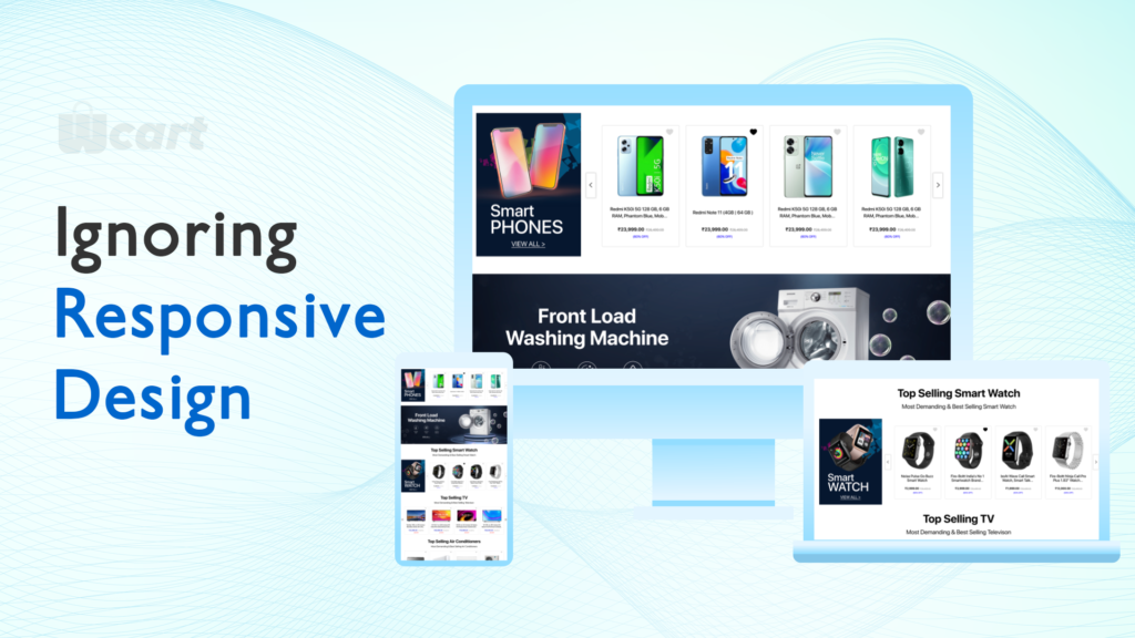
Neglecting responsive design leads to a non-adaptive website, hampering user experience on different devices and screen sizes due to static layout and content, causing distortion, zooming, scrolling issues, and navigation challenges on smaller screens..
The consequences of ignoring responsive design are significant.
- Firstly, users who visit your website on mobile devices may encounter difficulties in reading the content or interacting with the elements, leading to frustration and abandonment.
- Secondly, a non-responsive website can negatively impact your conversion rates, as users are less likely to make purchases or complete desired actions if the website is not optimized for their devices.
Moreover, search engines like Google prioritize mobile-friendly websites in their rankings. If your website lacks responsiveness, it may receive lower visibility in search results, reducing organic traffic and potential customer reach.
To avoid these issues, it is crucial to prioritize responsive design during the website development process. By implementing responsive design principles and techniques, your website will automatically adjust its layout, content, and functionality to provide a seamless and user-friendly experience across all devices. This ensures that visitors can easily navigate, read, and interact with your website, leading to improved engagement, higher conversion rates, and enhanced user satisfaction.
Overcomplicating the Navigation

One of the common mistakes in shopping website design is overcomplicating the navigation, which can result in a frustrating user experience and hinder conversions. Here are some key aspects to consider to avoid overcomplicating the navigation:
- Clear Menu Structure: Ensure that your website has a clear and intuitive menu structure. Use concise and descriptive labels for menu categories and subcategories, making it easy for users to understand and navigate through the different sections of your website.
- Limit the Number of Menu Items: Avoid overwhelming users with an excessive number of menu items. Focus on the most important and relevant categories that align with your target audience’s needs and preferences. If you have a large product catalog, consider using dropdown menus or submenus to organize the content.
- Consistent Navigation Placement: Place the main navigation menu in a consistent location across all pages of your website. Users should be able to easily find and access the menu, regardless of their location on the site. A fixed or sticky navigation menu can be helpful for ensuring it remains visible as users scroll down the page.
- Breadcrumb Navigation: Implement breadcrumb navigation to provide users with a clear path back to previous pages. Breadcrumbs enhance the user’s understanding of their location within the website hierarchy and enable easy navigation through different levels of the site.
By simplifying and optimizing the navigation structure of your shopping website, you can enhance user satisfaction, reduce bounce rates, and increase the likelihood of conversions. A user-friendly and intuitive navigation system ensures that visitors can easily find what they are looking for, leading to a positive user experience and improved overall website performance.
Not Prioritizing Website Speed
One of the common mistakes in shopping website design is neglecting to prioritize website speed. Slow-loading websites can have detrimental effects on user experience, conversions, and search engine rankings. Here’s why website speed is crucial and how to avoid this mistake:
Importance of Website Speed:
- User Experience: Users expect fast-loading websites and have little patience for slow ones. Slow speeds lead to frustration, higher bounce rates, and potential loss of customers.
- Conversions: Studies show that even a one-second delay in page load time can result in decreased conversions. Fast-loading websites create a seamless browsing experience and encourage users to complete purchases.
- Search Engine Rankings: Search engines like Google consider website speed as a ranking factor. Slow websites may be penalized in search results, leading to lower organic traffic and visibility.
Factors Affecting Website Speed:
- Image Optimization: Compress and optimize images to reduce file sizes without compromising quality. Use the appropriate image formats (JPEG, PNG, etc.) and implement lazy loading techniques.
- Caching: Utilize caching mechanisms to store frequently accessed website data, reducing the need for repeated requests to the server and improving load times.
- Minify Code: Minify HTML, CSS, and JavaScript files by removing unnecessary characters, whitespace, and comments. This reduces file sizes and improves loading speed.
- Hosting and Server Optimization: Choose a reliable hosting provider with robust infrastructure and consider using content delivery networks (CDNs) to distribute website content across multiple servers globally.
Performance Testing:
- Conduct regular performance tests using tools like Google PageSpeed Insights, GTmetrix, or Pingdom. These tools analyze website speed, identify bottlenecks, and provide recommendations for improvement.
- Monitor website performance using tools like Google Analytics to identify slow-loading pages and areas for optimization.
Optimize Third-Party Scripts and Plugins:
- Limit the use of unnecessary third-party scripts and plugins, as they can impact website performance. opt for lightweight alternatives or consider removing those that do not contribute significantly to the user experience.
By prioritizing website speed and implementing optimization techniques, you can enhance user satisfaction, increase conversions, and improve your website’s visibility in search engine results. A fast-loading shopping website provides a competitive advantage, as it ensures a smooth browsing experience and encourages visitors to engage with your products and services.
Poor Product Presentation
Another mistake to avoid in shopping website design is poor product presentation. The way you present your products on your website can significantly impact user engagement, conversions, and sales. Here’s why product presentation matters and how to avoid this mistake:
Importance of Product Presentation:
- User Engagement: High-quality product images, videos, and descriptions can capture users’ attention and encourage them to browse further. Users are more likely to engage with products that are visually appealing and presented in a clear, organized manner.
- Conversions: The way you present your products can directly impact your conversion rates. Compelling product descriptions and images can help users make informed purchase decisions and increase their likelihood of completing a purchase.
- Sales: Effective product presentation can boost sales by highlighting the unique selling points of your products and differentiating them from competitors.
Tips for Effective Product Presentation:
- High-Quality Images: Use high-quality images that showcase your products from different angles and in various contexts. Zoom features, 360-degree views, and videos can provide a more comprehensive view of your products.
- Descriptive Product Titles and Descriptions: Use descriptive and compelling product titles and descriptions that highlight the features and benefits of your products. Use language that resonates with your target audience and encourages them to take action.
- Organized Product Categories and Filters: Organize your products into logical categories and provide filtering options to help users find products quickly and easily.
- Reviews and Ratings: Include reviews and ratings from previous customers to build trust and provide social proof of your product’s quality and value.
- Product Comparisons: Provide a comparison feature that allows users to compare products side-by-side, helping them make informed purchase decisions.
By focusing on effective product presentation, you can enhance user engagement, increase conversions, and drive sales. A well-presented product can communicate its value and unique selling points, enticing users to make a purchase. Ensure that your product presentation is visually appealing, organized, and informative to provide a seamless and enjoyable user experience.
Conclusion
In conclusion, avoiding common mistakes in shopping website design is crucial for creating a successful online shopping experience. Neglecting user-friendliness, responsiveness, simple navigation, speed, and product presentation can harm user engagement, conversions, and performance.
By prioritizing user-friendliness, responsiveness, simplicity in navigation, website speed, and effective product presentation, you can create a seamless and enjoyable shopping experience that drives user satisfaction, increases conversions, and boosts sales. Take the time to carefully plan and execute your shopping website design, ensuring that it aligns with best practices and user expectations.
Frequently Asked Questions(FAQs)
How important is the overall design of a shopping website?
The overall design of a shopping website plays a crucial role in attracting and retaining customers. A well-designed website creates a positive user experience, builds trust, and enhances the brand image. It should have a visually appealing layout, intuitive navigation, clear product categorization, and easy-to-use search functionality.
What elements should be included in the homepage of a shopping website?
The homepage of a shopping website should provide a snapshot of the store’s offerings and entice visitors to explore further. Key elements to include are a prominent and visually appealing banner showcasing featured products or promotions, clear navigation menus, a search bar, special offers or deals, popular product categories, customer reviews or testimonials, and trust indicators such as secure payment icons.
How can I optimize the product pages for better conversions?
To optimize product pages for better conversions, consider the following:
1.High-quality product images
2.Descriptive product information
3.Compelling product descriptions
4.Clear call-to-action (CTA)
5.Customer reviews and ratings
6.Related products and cross-selling
Should I prioritize mobile responsiveness in shopping website design?
Absolutely. With the increasing use of smartphones and tablets for online shopping, mobile responsiveness is crucial. Shoppers expect a seamless browsing and purchasing experience across devices. A mobile-responsive design ensures that your website adapts to different screen sizes, maintains usability, and allows customers to easily navigate, view products, and complete transactions on their mobile devices.
What are the key elements of an effective shopping website design?
The key elements of an effective shopping website design include intuitive navigation, visually appealing product displays, streamlined checkout processes, and secure payment options. Additionally, a mobile-responsive design is crucial to ensure a seamless shopping experience across devices.


Leave a Reply