
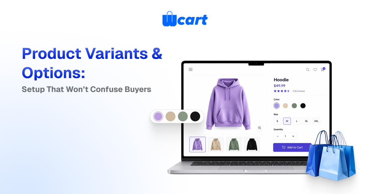
Product variants in ecommerce are the purchasable versions of a single product. Think of a T-shirt in Small/Black, Medium/Black, and so on. To set them up without confusing buyers, define a small number of clear options (like Size and Color), generate the specific variants from those options, give every variant its own SKU, price, and stock, and only show choices that can actually be bought.
Keep your option names consistent across the catalog, use swatches for color and buttons for size, and disable or hide combinations that don’t exist. Done well, variants reduce duplicate listings, cut returns, and make the add-to-cart decision feel obvious.
Most catalog confusion isn’t really a design problem. It’s a data-modeling problem that leaks onto the product page. When a shopper can’t tell whether “Blue” is sold out or just unavailable in their size, they leave. This guide walks through how to model and configure product variants ecommerce the right way, the trade-offs between a few common approaches, and the specific UI and inventory rules that keep the buying decision clean.
Options vs. variants: get the vocabulary right first
Almost every variant mistake starts with mixing up two concepts. Getting these straight makes everything downstream easier.
What an option is
An option (sometimes called an attribute or option type) is a dimension of choice: Size, Color, Material, Storage capacity. Each option has values. Size has Small, Medium, Large; Color has Black, Navy, White. Options are how the shopper thinks about the product.
What a variant is
A variant is one concrete, sellable combination of option values, like “Medium / Navy.” A variant is what actually has a SKU, a barcode, a price, a weight, and a stock level. The product is the umbrella. The variant is the thing in the box.
How to set up product variants step by step
The sequence below is the order we recommend in practice. Follow it and you avoid the most common rework, which is renaming options after you’ve already generated SKUs.
1. Decide your options before you touch the catalog
- Pick the smallest set of options that genuinely changes what the customer receives or pays. If two “variants” are identical in price, weight, and fulfillment, they probably shouldn’t be separate variants. Standardize the option names globally.
- Always “Color,” never “Colour” on some products and “Shade” on others. Inconsistent option names quietly break faceted filtering and search across your store.
2. Define option values with display rules in mind
- For each option, list its values and decide how each will render: color as swatches, size as buttons or a dropdown, material as labeled chips. Order the values logically (S, M, L, XL, never alphabetical) so the control reads naturally.
3. Generate variants, then prune
- Let the platform generate the full matrix, then delete combinations you will never sell. A “32-waist / 38-inseam” pair that doesn’t exist should not be a variant sitting at zero stock. It should not exist at all. Pruning at creation time is the cheapest way to avoid dead options on the storefront.
4. Assign SKU, price, and stock per variant
- Every variant needs a unique, human-readable SKU (for example,
TSHIRT-NVY-M). Set per-variant price only where it differs, such as larger sizes or premium materials, and otherwise inherit the product price. Attach inventory at the variant level so each combination tracks its own stock.
5. Add per-variant images where it matters
- Color variants need their own photos; size variants usually don’t. Map images to the value (all “Navy” variants share the navy photo set) rather than to every individual variant, so you don’t re-upload the same image twelve times.
6. Configure availability behavior
- Decide what happens when a variant is out of stock: hide it, show it disabled, or allow backorder. This one setting drives most of the perceived “confusion” on a product page, so treat it as a deliberate choice and not a default.
- Here’s what actually happens when you leave it on the default: shoppers add a sold-out size to cart, hit an error at checkout, and half of them never come back to retry.
The product page rules that prevent buyer confusion
Modeling is half the job. The other half is how choices surface to the shopper. These are the patterns that consistently reduce hesitation at the option selector.
Show only what can be bought
- If “Black” is sold out in every size, either hide it or clearly mark it sold out. Never let a shopper select it, choose a size, and only then learn it’s unavailable. The strongest pattern is contextual availability: once a shopper picks a size, gray out the colors that don’t exist in that size rather than letting them hit a dead end.
Match the control to the option
- Color belongs on visible swatches, sizes on tappable buttons, and only long lists (like 30 ring sizes) on a dropdown. Hidden dropdowns for color force an extra click and hide the very thing shoppers came to compare.
- The W3C’s guidance on accessible form controls is a good baseline. Selectors must be keyboard-navigable and properly labeled, not just visually styled. See the W3C Web Accessibility forms tutorial.
Reflect the selection everywhere
- When a variant is chosen, update the price, the main image, the SKU, and the stock message together. Nothing erodes trust faster than a page that still shows the default photo after the shopper picked a different color.
Default to a real, in-stock variant
Pre-select a sensible default, like a popular in-stock color, so the page never loads in a half-chosen state where Add to Cart is mysteriously disabled.
Variant modeling approaches compared
There’s more than one way to represent variation, and the right choice depends on how different the “variants” really are.
| Approach | Best for | Pros | Watch out for |
|---|---|---|---|
| Single product with variants | Same item in size/color (apparel, footwear) | One listing, shared reviews/SEO, clean compare | Variant explosion if you add too many options |
| Separate products, linked | Items that differ a lot (bundle vs. single, scent lines) | Distinct pages, distinct SEO, full per-item control | Split reviews; manual cross-linking; duplicate effort |
| Product personalization (custom fields) | Engraving, monogram, gift message | Infinite input without infinite SKUs | Not real inventory; never use for stock-tracked choices |
| Add-ons / modifiers | Optional extras priced on top (warranty, gift wrap) | Keeps the base variant simple | Can clutter the page if overused |
A useful rule: if the choice changes the SKU you ship and the stock you count, it’s a variant. If it only changes text you print or a service you add, it’s personalization or an add-on. Forcing engraving text into the variant matrix is one of the fastest ways to create thousands of phantom SKUs.
Inventory, SKUs, and the data that keeps it sane
Variants are where catalog data and inventory data meet, so a few disciplines pay off repeatedly. For businesses managing large catalogs, an enterprise ecommerce platform can help centralize variant data, inventory, and product information across the store.
SKU conventions
- Use a consistent, parseable pattern like
PRODUCT-COLOR-SIZEso a human can read a SKU and a script can split it. Avoid spaces and ambiguous characters. Keep the parent product code stable even if marketing renames the product, because your fulfillment, returns, and accounting all key off the SKU. - We’ve seen a single rename break months of order history in a 3PL feed, and untangling it is far worse than picking a boring code and never touching it.
Track stock at the variant level
- Stock lives on the variant, not the product. The product’s overall availability is derived: it’s “in stock” if any sellable variant has inventory. If you also sell across locations, that derivation gets more involved.
- Our guide on multi-warehouse inventory management covers syncing stock across warehouses so a variant doesn’t show available when the nearest location is empty.
Importing variants in bulk
- When you load variants from a spreadsheet, the parent-child relationship is the part that breaks. Each variant row must reference its parent product and carry its own SKU and option values. A missing parent reference creates orphan products that look like duplicates on the storefront.
- If you’re importing at scale, read our walkthrough on bulk product CSV import before your first big upload. It covers the exact column structure that keeps variants attached to their parent.
Don’t let structured data drift
- If you publish product schema for search engines, variants should be expressed as offers under one product, with availability and price per offer. Google’s documentation on product structured data explains how variant offers are represented;
- keeping your storefront data and your markup in sync helps rich results show accurate prices and stock. See Google’s product structured data guide.
Common mistakes and how to avoid them
- Too many options. Every option multiplies your variants. Three options is usually the practical ceiling for a clean page.
- Inconsistent option names. “Color” vs “Colour” vs “Shade” fragments filters and search. Standardize globally.
- Dead combinations at zero stock. Prune impossible variants instead of leaving them perpetually sold out.
- No default selection. A page that loads with Add to Cart disabled feels broken even when it isn’t.
- Personalization modeled as variants. Use custom fields for engraving and monograms, never the variant matrix.
- Images mapped per variant, not per value. Map photos to the color value so you upload each shot once.
If you’re standing up a new catalog and want the platform side handled, including variant matrices, per-variant inventory, swatches, and multi-vendor support out of the box, that’s exactly what Wcart is built for.

























Leave a Reply